Notes
[alt text]
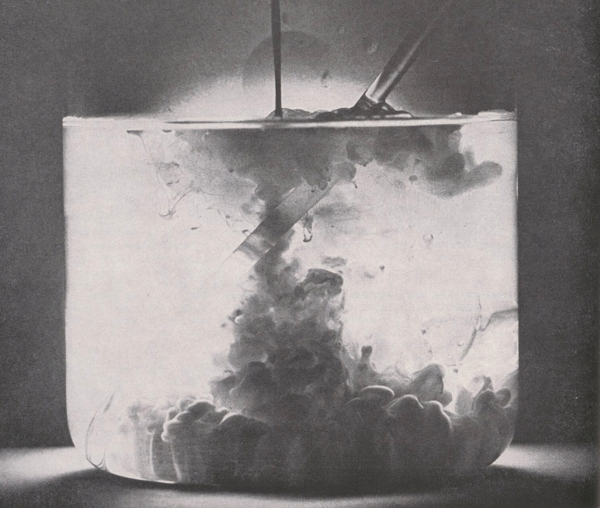
A black-and-white pharmaceutical advertisement features a glass jar tipped on its side with pills spilling out, centered on a dark background. The ad promotes Kohnstamm flavor and color additives, emphasizing making medicines more appealing in taste and appearance.
[transcription]
#Kohnstamm flavor
Even the ugh-est medicines are easy to take when formulated with Kohnstamm flavors. From our modern flavor factory in Kearny, New Jersey comes a wide-ranging variety of dry and liquid flavors. Genuine fruit blends in highest concentration. Imitation flavors. And Spralene© dry flavors for tablets and chewables. Want a color as appealing as the flavor? The Kohnstamm spectrum would make any pharmaceutical look more appetizing. Much of what we have learned over the past 100 years is in the booklet, “Flavoring Materials for Pharmaceuticals.” It’s crammed with useful information. Write for it.
H. KOHNSTAMM & CO., INC.
SERVICE THROUGH CHEMISTRY SINCE 1851
First Producers of Certified Colors. New York 10013, Chicago 60611, L.A. 90058, Mexico D.F. & branches in principal cities coast to coast.
[additional notes] – Violet Webber
The ad appears to be for both colors and flavors from the same company. The black and white choice for the ad is interesting, since they are promoting colors. Was this done on purpose to show the medications if the brand’s colors were not used? The ad exphasizes appealing flavors and colors for medication, focusing more on aesthetics than treating illnesses. The pills spilling from the container distances the ad from the clinical context, treating it similar to how you would arrange food. The language is simple, describing medicine as “ugh-est” and “appetizing”. Some 1960s prescription bottles appear to be glass, so I wonder if that choice was because that was common or to make the medication seem more appealing and desirable.
- Title
- Notes