an archive of all images for the research project on food technology advertisements
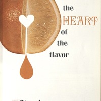
for the HEART of the flavor
Alt Text: A light warm background with a cutted orange. At the center there’s the heart where the orange juice was dropped. The contrast of text color between black and Orange also emphized the key of the ad “HEART”.
Text transcription: for the HEART of the flavor
Observations: This ad’s central focus is demonstrating the flavor of cutted orange. At the center there was a heart shape and the juice is drizzling down. That’s the highlight of the flavor, and emphasize of the slogan. Although the design used “emotional and symbolic language” still the ad made food to be industrialized, not home cooked. By Tom Liu